Arts Council England
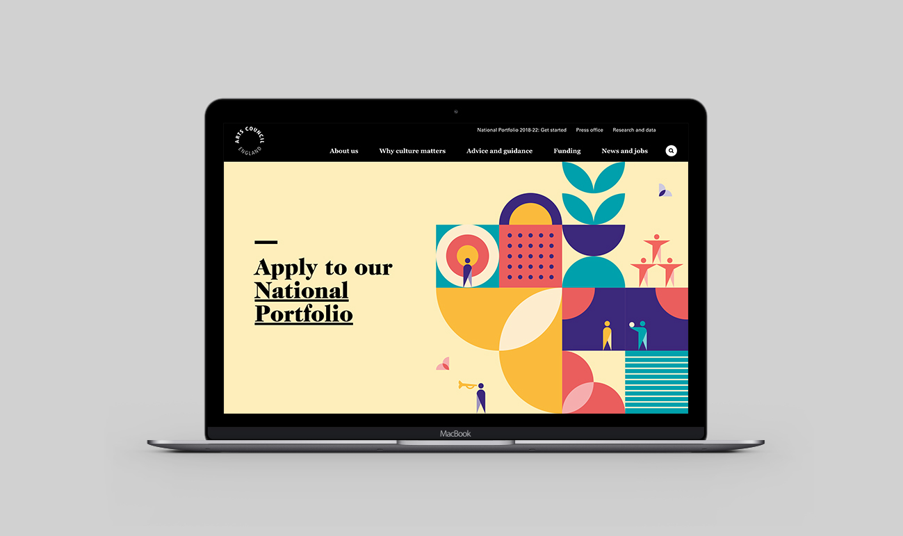
Flow Creative was asked to design a brand tool-kit and visual identity for Arts Council England's 2018-22 Investment Process. Flow hired me at the beginning of the project to work on the brand research and creative direction of the identity across both print and screen. I continued to work with Flow as the lead designer on this project from concept through to completion.


The brief outlined three main objectives; to create an identity that was simple and easy to understand; to create a flexible design that could be applied across multiple digital and tangible platforms; to comply with Arts Council England’s brand guidelines.
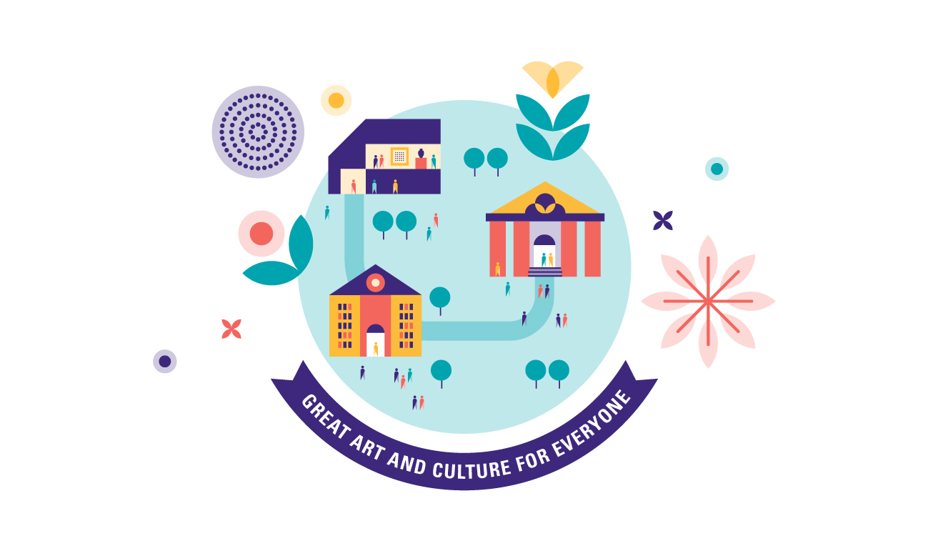

We decided to put nourishment and growth at the centre of the Investment Process. We were keen to liken the process to growing a plant; first you sow the seeds (funding) and then you provide nourishment through regular sunshine and watering (advice), helping creative organisations to grow roots and flourish.

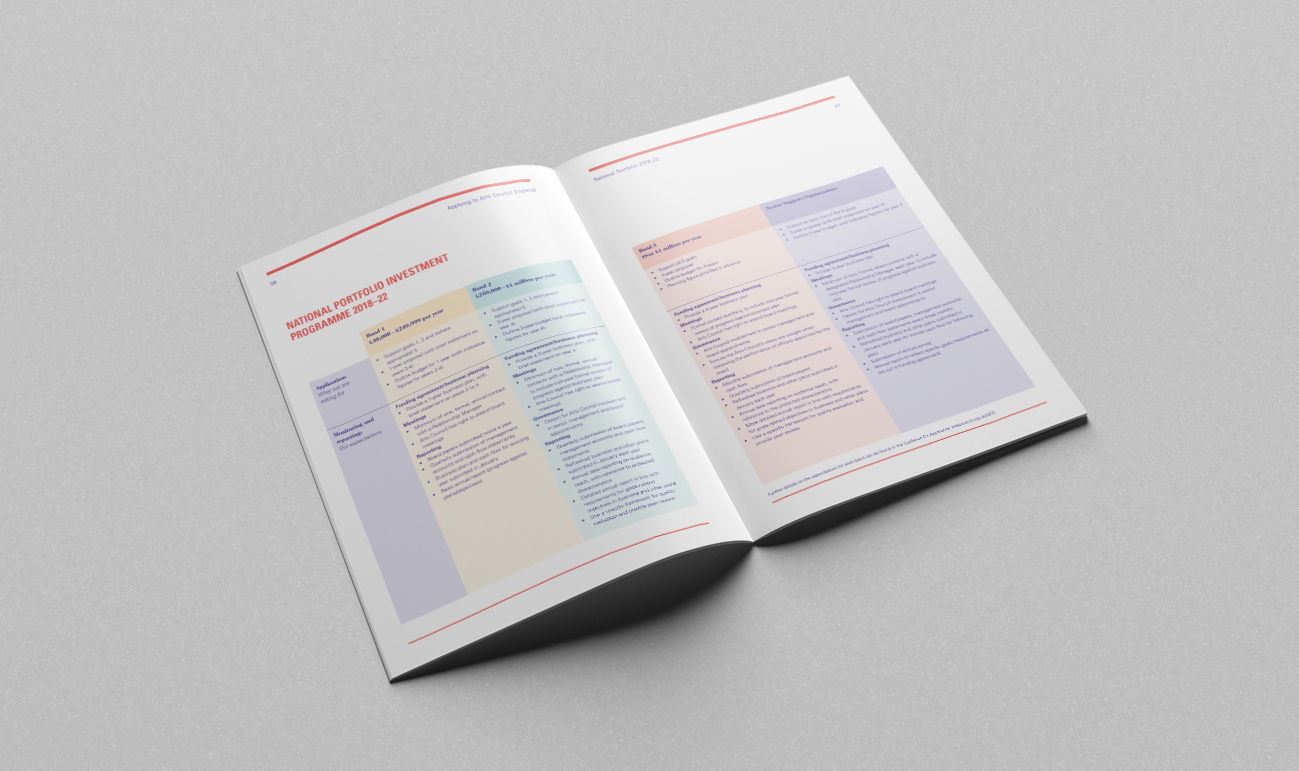

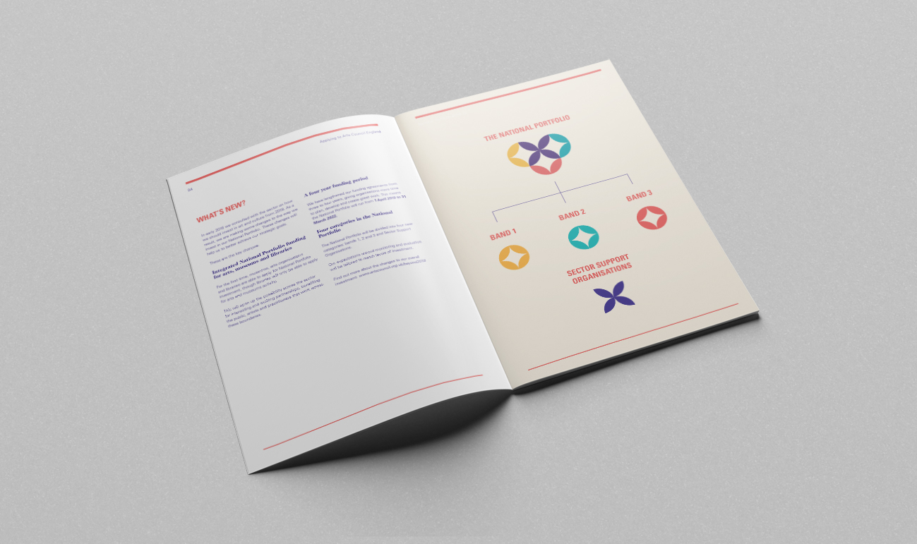

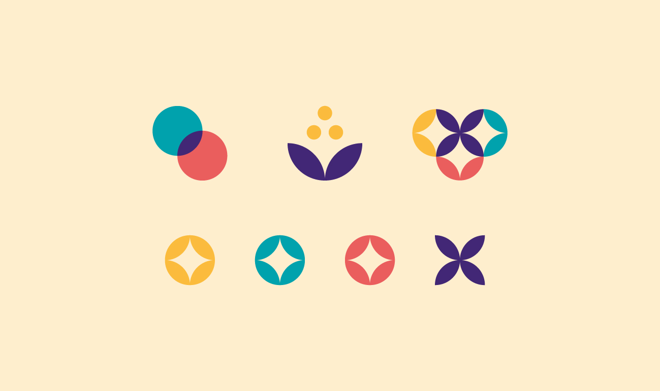
Our brand research lead us to focus on flexible identity systems and geometric illustration. Graphic elements were created to represents abstract, organic structures such as flowers and other plantlife. A graphic-system was created that allowed us to build a consistent visual style from icon design to illustrating large scenes.


Arts Council England asked us to create an icon for of each their main funding streams; Grants for the Arts, Strategic Funding and The National Portfolio Organisations. The icon for NPO is made up of four shapes representing the bands within this particular funding stream. In the centre of the NPO icon sits the shape for 'Sector Support Organisations' to represent their role as providing support to creative organisations.

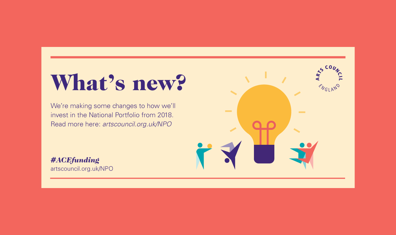
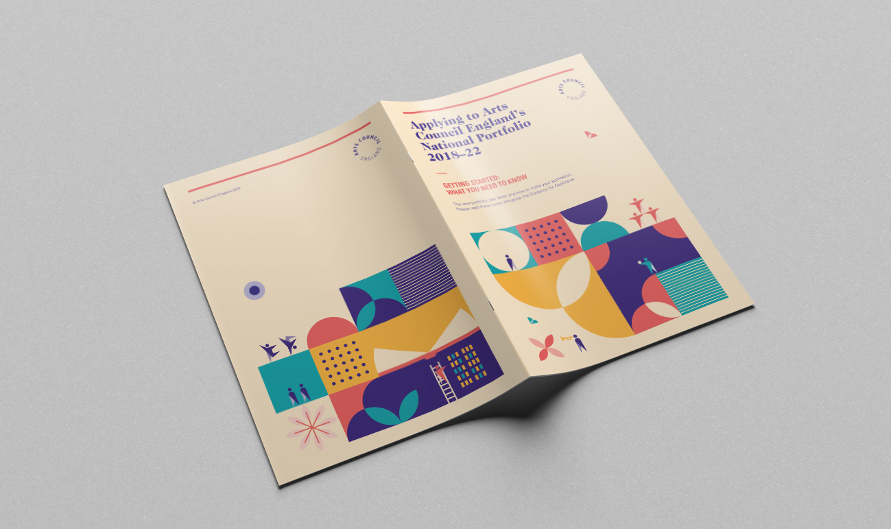
Deliverables included designing a range of digital documents, a printed brochure, social media cards and an animated video. Our branding for the funding investments process took over the Arts Council England homepage whilst applications were open.
